The appeal of Internet shopping is one based on ease and convenience. Goodbye to long queues at checkouts and hello to click and pay.
By Roelant Prins, CCO of Adyen
The smallest details can have the biggest impact on customer experience. A seemingly straightforward task such as clicking and paying can be mismanaged payment pages that, all to often, prove to be more a source of frustration and discouragement, than a convenience.
A recent poll from a payment association found that 45% of consumers had, at some point, abandoned the shopping trolley upon reaching the payment stage. Understandably, businesses selling online want to know why this is happening and what they can do to tackle the problem.
Transparency helps
Transparency into payment processes is one of the most critical areas when it comes to ensuring a successful, positive shopping experience.
At a recent roundtable discussion Adyen held with some of Europe’s brightest ecommerce companies, we heard the same concern time and again – large numbers of shoppers apparently abandoning their shopping trolleys at a late stage once the true cost of delivery becomes apparent.
There’s a very straightforward way to avoid this, and that’s by explaining to the customer the true extent of delivery charges that are to be incurred at the beginning of the transaction process. This engenders, more than anything else, a feeling of security and goodwill from the shopper.
It might sound obvious, but it’s surprising how easy it is to forget this sort of thing.
Similarly, concerns were raised during the course of our discussion about the numbers of buyers abandoning the payment process because of a lack of understanding of the differing methods of payment that were available. An effective payment page enables the customers to access and understand methods of payment which are presented clearly and concisely at the start of the process.
A good example can be seen with 3-D Secure, a relatively new set of security standards introduced by Visa and MasterCard for securing online credit card payments. 3-D Secure works by redirecting shoppers to the site of the issuing bank in order to validate a payment.
For many shoppers this is still a new and unclear procedure – especially the further you go south in Europe. Analysis of our data has shown that in around 30% of 3-D Secure sessions (where a cardholder is redirected to its bank) the payment process has been abandoned by the shopper.
This strongly speaks for the selective offering of 3-D Secure by merchants for things like high value payments, or in certain markets.
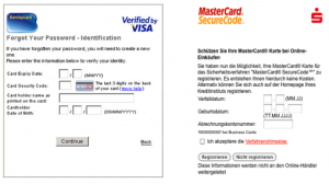
3-D secure screen shots
Tailoring the experience is crucial and this goes beyond payment options.
Sometimes the very best solutions are the ones that go completely unnoticed. Even though it is likely the customer will be completely unaware, a seamless, tailored payment experience is a valuable part of shopping.
Tailoring the experience is important for any business, and this includes ecommerce. It’s not only practical and achievable, but also provides the shopper with an easier and smoother online experience, without moving them from one web page to another. The aim is to provide ease of accessibility and to present relevant information clearly and effectively.
For instance, identifying the country in which a purchase is being made and establishing the most likely payment methods for that region, removes the hassle of trawling through various, irrelevant, payment methods for the customer.
The majority of international businesses still regard credit and debit cards as the ultimate payment method for online shoppers, but in reality, this is not the case.
A recent YouGov poll found that 31% of online shoppers wanted a wider range of payment methods. New payment methods geared towards the online market, such as PayPal, iDeal, prepaid cards and real-time online banking, have seen huge uptake from shoppers.
Adyen recently began working with a company called PhotoBox, an internet-based digital photo printing company that personalises and processes millions of prints for its customers ever day.
Before going live with our payment platform, we took a look at some of the key local markets for PhotoBox – places like Sweden, Benelux, Germany and Poland – and tailored our service to support a range of payment methods that were popular in these regions. PhotoBox recorded an instant 8% increase in payment conversions the moment it went live with our system.
Additionally, it has been hard not to notice the impact Smartphones have had on the ways in which people shop, meaning that shopping can be as easy as holding a handheld device. Tailoring the experience for these shoppers works in exactly the same way.
Remember: less is more
People are busier than ever. The growth in mobile payments not only serves to demonstrate that people are on the move, but also that they are leading hectic and busy lives.
One aspect of this is a move towards streamlining the payment process. ‘One click’ payments enable shoppers to make payments at the click of a button having entered just the card’s CVC code. The rest of the details are safely stored following a prior purchase.
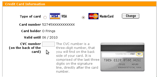
CVC Code input screenshot
Attendees at our roundtable told us that implementing this simple procedure has been show to increase their payment conversion rates by as much as 20%. Many sites will have several pages for each payment process, when a single page, or in some cases, just the CVC, is more than enough.
Technological developments in areas such as Java Scripting and the use of AJAX software, enables content to be dynamically changed rather than the page having to reload to recognise the new information. It’s all about making it as simple as possible for the shopper.
And this is where the look and feel of a web page comes in.
Outsourcing a payment page to a third party payment processor has become common practice for e-tailers as it allows merchants to bypass various compliancy, legal and contractual pitfalls. But deprived of any of the features of the “parent” website, lacking in consistency and any cohesion, the payment pages start lose the character, feel and security which has drawn the shopper to the website in the first place. Ensuring continuity – the look and feel – once the customer reaches the payment checkout pages is crucial for conversion.
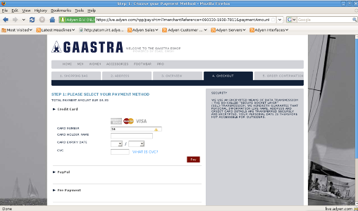
Gastra payment page
Shoppers need to have the feeling that their money is totally secure, and again, fine-tuning the overall look and feel of the payment page – removing bank logos, processor logos etc- will help support this feeling.
Take easy steps
It’s no surprise that shopping trolleys tend to end up abandoned when the complicated maze of payment pages becomes too much for unsuspecting shoppers. As mentioned, online shopping is all about convenience, but this can all too easily be forgotten without due care and attention.
By following these four simple steps, customers can benefit from an effortless shopping experience, and merchants can move towards improving the all important bottom-line:
1. Transparency: customers should be ‘in the know’ from the start
2. Tailoring: payment pages need to be suited to individual shoppers
3. Less can be more: streamline and simplify the payment experience for your customers
4. Consistency: present a consistent look & feel for your website and payment page
Follow these steps and you’ll not only improve your payment conversion rates, but you’ll have happy, loyal customers who will return to your site time and again.