When you visit an online store, there are many elements which could affect the way you judge it. For most online retailers, the layout, site speed and imagery used are high on the list of priorities but colour has a big impact too.
“When it comes to picking a colour for your brand you may think it’s an arbitrary decision, or something you don’t need to pay personal attention to because you don’t have an artistic streak, but colour choice is as much a strategic decision as any other consideration you may put into your business,” says Michelle Innes, Creative Director at Rose Innes Designs.
Colours evoke certain feelings in users, mostly subconsciously. Before any of your products or your content has had a chance to make an impact on someone, the colours you have chosen for your branding and your website have beaten them. It’s all to do with colour psychology and it is worth looking into whether you are starting from scratch or re-branding.
“Colour psychology is how the brain feels with colour, the reactions and feeling certain colours offer and the study of the impact colour has on our behaviour,” says Ed Gould, Creative Director of integrated marketing communications agency, Carswell Gould.
“Colours can help users understand where they are on a site, what is expected of them and where they need to go. They can also be used to signpost and draw attention to specific things that will deliver a business return. Users are used to certain colours meaning certain things and for that reason designers will tend to use the same colours to offer consistency of use eg red for a warning messages or alert.”
So what considerations are there when you’re thinking about your colour scheme?
What do you want your brand to communicate?
All considerations start with your business. What is it all about? Who is your target audience? Colours can go along way to say something about your brand before you have even said anything or shown off your great products or services.
There are some general interpretations of basic colours which many brands use to convey their message.
Red
As well as calling attention to something such as a warning message as Gould suggested red can convey feeling of love, warmth and confidence.
White
White makes people think of purity and wholesomeness as well as clarity and simplicity.
Yellow
As an exciting and optimistic colour yellow can convey adventure and happiness.
Green
In a fairly obvious way green can translate as natural and organic but also of relaxation and harmony.
Blue
Often used by large corporates, blue conveys trust, high-quality and productivity.
Brown
Again, brown is a natural colour which also carries a sense of heritage, comfort and friendliness.
Grey
Usually associated with seriousness and conservatism, grey is another favourite of the corporate world.
Purple
With its historical association with royalty, purple inspires ideas of grandeur as well as mystery and authority.
Pink
As well as its obvious association with femininity, pink can create feelings of kindness and calm.
Black
Black gives off strength and power as well as a sense of confidence and classical quality.
How to make colours work for you
There are exceptions to every rule and the guidelines are by no means a science. Colours can change their implied meaning depending on the particular shade that’s used and also the saturation of the colour. Strong colours are good to create recognition with a brand but too much of a strong colour on a page can be hard to look at.
You might also need to take into account that colours mean different things in different cultures. If you have an international brand with a strong presence in various countries, you should research what your chosen colours might say in these different markets first.
Another significant consideration should be the colours of your competitors. If you were launching the next big social network, using the dark cobalt blue of Facebook wouldn’t be a great plan or would using Twitter’s bright azure blue. Sometimes this means breaking with the colour associations listed above.
“You may feel you want to stand out from your competitors, rather than choosing colours that will make your brand blend in with more established, and trusted, players in your field,” says Innes.
“This is a trade-off that requires consideration. A company that “owns” a certain colour for their brand or packaging within an industry does become more recognisable, but as a start up your key focus is going to be on winning customers and their trust at first.”
Once you have decided on a main colour which you want to work with, start looking at other associated colours. Working from a restricted palette of complementary colours is easy on your customers eyes.
Don’t be afraid however of using contrasting colours in isolation to draw attention to something. If you stick to a colour scheme throughout, using a completely different colour can help to draw attention to something – a call to action button for example.
Some examples of brands which have leverages colour associations well are:
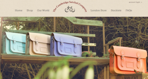
Cambridge Satchel Company
These satchels are handmade and designed in a vintage English-style. Using a brown/natural colour pallet reminds people of the historical relevance of the satchels as well as their more ethical creation process.
Net-A-Porter
This is a fashion sites aimed at the luxury market. The classy use of black with lots of white space exudes high-quality and clarity.
Mini Cooper
The Mini by its very nature has historically been thought of as a friendly and somewhat cute car. The website is making an obvious move away from that association by using lots of black and red. The result is a powerful and confident product with a dangerous streak thanks to the red.


Speak Your Mind